Best Presentation Software for Public Speakers
Keynote and PowerPoint excel when slides support speakers instead of replacing them.

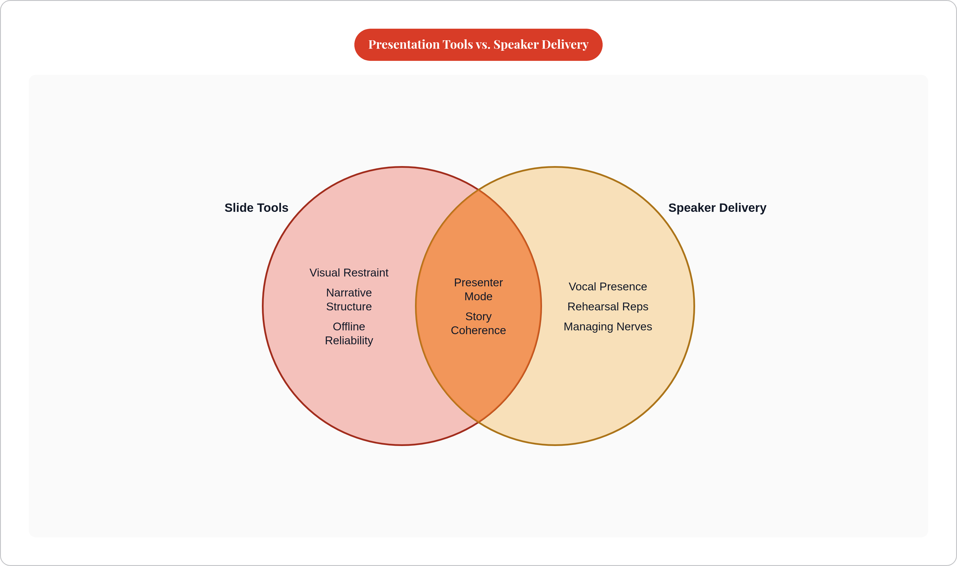
The question that determines whether a presentation actually works is whether the slides help the audience focus on the speaker or quietly compete with them. Debates about fonts, transitions, and which AI builds a fifty-slide deck fastest waste everyone's time. Research on communication consistently shows that the words on a screen account for a fraction of what an audience actually receives; the bulk travels through vocal delivery and physical presence. A text-heavy, animation-saturated deck isn't neutral. It is actively cannibalizing the channel where most of the speaker's meaning lives.
What the best presentation tools actually have in common when a speaker is standing in front of a room
Strip away the marketing and four qualities reliably separate tools that serve speakers from tools that serve builders.
The first is visual restraint by default, not by discipline. The best tools make the sparse slide the path of least resistance. The second is narrative structure: tools that push the speaker to think in story beats rather than bullet lists produce decks that support a spoken arc rather than replace it. The third is reliability at showtime. Conference venues have notoriously unreliable WiFi, and a speaker mid-talk is not in a position to troubleshoot a cloud-sync error. The fourth is a superior presenter mode: speaker notes, next-slide preview, and elapsed-time display visible only to the speaker, keeping them oriented without exposing the scaffolding to the room.
One criterion is deliberately absent from this list: speed of deck creation. AI tools that generate a presentation in thirty seconds are optimizing for the builder's convenience, which is a legitimate goal but a different one. Speed of assembly and quality of delivery are not the same currency.
The science on why narrative structure matters so specifically is instructive. Research by Chang, Nastase, and Hasson (2024) found that effective storytelling drives convergence across multiple listeners' brain responses simultaneously. In practical terms: the speaker's coherence of argument does more work than any slide's visual flair. The deck is the speaker's support structure. It is not the story.
Every tool evaluation below is measured against these criteria, not against feature count, price, or the sophistication of the underlying AI model.
Apple Keynote: the tool that quietly sets the standard for speaker-first design
Keynote does not have the largest market share or the most aggressive product roadmap. What it has is a design philosophy that defaults toward restraint: clean transitions, generous whitespace, and templates that resist the urge to fill every pixel. That is not accidental. It reflects a product opinionated enough to decide that less is usually correct.
The professional speaker circuit reflects this. TED speakers and high-stakes conference presenters choose Keynote with notable frequency, not because it offers the most capability but because it imposes the least interference. When the room experience is the primary product, interference is the enemy.
Keynote's Presenter Display is, practically speaking, the best implementation of live-delivery support available. Speaker notes, next-slide preview, elapsed timer, and current slide are all visible simultaneously to the speaker and invisible to the audience. Competitors offer versions of this; Keynote's version is simply cleaner and more reliable in practice.
The constraint is real and worth stating plainly: Keynote is almost entirely Apple-native. A speaker presenting from a Windows machine, or in a mixed-device environment where the organizer controls the hardware, loses most of what makes Keynote valuable. The ecosystem lock-in is the price of the experience.
Best fit: professional speakers, coaches, and anyone for whom the room experience is the primary deliverable and who controls their own hardware.
Microsoft PowerPoint with Copilot: the default that finally learned to help speakers think
PowerPoint's familiarity is a genuine, underrated advantage. On the day of a talk, cognitive overhead is a resource a speaker cannot spare. When the tool requires no learning curve, that overhead goes to zero. That matters more than it sounds.
The Copilot integration meaningfully changes what's available to speakers. It can generate an entire presentation from a document, which is useful, but the more valuable function for experienced speakers is the reverse: it can summarize and trim an overbuilt deck. Overbuilding is the more common problem. Speakers accumulate slides the way travelers accumulate luggage, and Copilot can help them leave things behind.
Speaker Coach, a feature that predates Copilot, is one of the more unusual things a slide tool has ever done: it provides real-time feedback on pace, filler word usage, and monotone delivery. This crosses from presentation design into verbal coaching territory, which is genuinely adjacent to what speakers need.
The persistent risk is that PowerPoint's defaults encourage text density. Every template, every blank slide, invites another bullet point. Copilot inherits that tendency. A speaker using PowerPoint with Copilot still has to work against the tool to achieve restraint, which means the best outcomes require deliberate counterforce. Copilot is a capable assistant; it is not a disciplinarian.
For enterprise users, the pricing calculus is simple: PowerPoint is bundled with Microsoft 365, which most organizations already pay for. The Copilot add-on carries an additional cost but is optional.
Best fit: speakers already embedded in Microsoft environments who want AI assistance and have no appetite for migrating to a new platform.
Prezi: when the format itself reinforces the speaker's narrative movement
Prezi is polarizing, and it is polarizing for the right reasons. The zoom-and-pan canvas is either a genuine structural advantage or a disorienting mess, and the variable that determines which is whether the speaker's argument has actual spatial logic. When the spatial structure maps to the argument, Prezi does something rare: it externalizes the speaker's mental map. The audience can see where they have been and where they are going, which reduces the speaker's job of verbal signposting considerably.
The survey evidence is worth citing directly. In a July 2025 Prezi survey, four out of five sales, marketing, training, and consulting professionals said Prezi was more effective at capturing audience attention than other tools. Ninety-one percent reported improved work outcomes after adopting it. The phrase "improved work outcomes" is the more interesting figure; users aren't describing better slides, they are describing better results, which implies that the delivery improvement is real and downstream.
The honest caveat is equally direct: Prezi in unskilled hands produces motion sickness and confusion. The format rewards speakers who have a clear spatial argument. It punishes those who don't. The tool is not the problem in the latter case; the argument is. Prezi just makes the absence of structure more visible than PowerPoint does.
Best fit: live pitches, teaching sessions, and storytelling-driven talks where the speaker wants the audience to feel movement through an idea rather than a succession of static frames.
Beautiful.ai: the tool that solves a problem speakers shouldn't have to think about
Beautiful.ai's Smart Slides feature auto-adapts layout as content changes. Add a sixth bullet point and the slide restructures itself rather than breaking. This sounds like a design convenience; for speakers who revise their deck the morning of a talk, it is operationally significant. Last-minute edits stop requiring a designer to fix what the speaker just changed.
The more important feature for live delivery is less discussed: Beautiful.ai has a desktop app. Among newer presentation platforms, that is genuinely uncommon. Conference venues have unreliable WiFi as a near-universal condition, and cloud-dependent tools carry real risk of failing mid-presentation. A speaker presenting to a large audience from a half-loaded cloud deck is a preventable disaster. Beautiful.ai removes that variable in a way that several competitors simply do not.
The March 2026 Context-Aware AI Workflow is worth noting because of the order of operations it enforces: the tool drafts a text outline before designing any slides. That sequence, narrative structure first, visual design second, is the correct one for speakers. Most AI tools invert it, producing visually complete slides before the speaker has confirmed the argument holds together.
Best fit: speakers who build their own decks under time pressure, conference presenters who cannot trust venue connectivity, and anyone who wants AI assistance that respects narrative architecture before aesthetics.
Gamma: what the fastest AI presentation tool is actually good for (and what it isn't)
Gamma's scale is legitimately striking. The platform surpassed 70 million users and $100M in annual recurring revenue as of November 2025. That trajectory reflects genuine market pull, not just favorable press coverage. People are using it because it solves a real problem: it can transform a topic description into a complete presentation, with layout, text, and images, in roughly thirty seconds.
The reframing that matters for speakers: if Gamma handles the draft deck, the speaker recaptures time that would otherwise go to slide assembly. Whether that time goes to rehearsal is the speaker's choice, but Gamma at least makes the choice available. In that sense, it is a delivery tool once removed.
The honest limitation is structural. Gamma's output defaults to web-document formatting: visually rich, scroll-friendly, information-dense. That format works well for asynchronous reading. It is not the same as a speaker-friendly slide, and the deck often needs substantive editing before it functions in a live talk. Using Gamma as a finished delivery asset, without the editing pass, is the mistake most users make.
One note on the competitive landscape: Tome, once positioned as Gamma's nearest rival, discontinued its Slides feature in April 2025. Any article still recommending it as a live alternative is working from outdated information.
Best fit: rapid prototyping of a deck structure and getting a first draft to react to; not a finished presentation to walk on stage with unless the speaker has applied editing discipline afterward.
Google Slides and Canva: the collaborative and the creative, evaluated on speaker terms
Google Slides
Google Slides' genuine strength is real-time collaboration. For a speaker working with a team to build a deck across time zones and devices, nothing matches its simplicity for shared editing. That is a real capability and worth naming as such.
The speaker-first verdict is more candid: Slides is adequate but not optimized. Its templates are generic, its defaults encourage text density, and its presenter view is functional without being distinguished. It does the job; it just does not do it especially well.
The most meaningful practical risk is cloud dependence. Without prior offline setup, no internet connection means no presentation. This is not a hypothetical failure mode. Speakers present in hotel ballrooms, corporate auditoriums, and rented event spaces with unreliable infrastructure. Google Slides requires proactive management of this risk; it does not eliminate it.
Best fit: team-built decks, classroom settings, and talks where collaborative accessibility outweighs the need for live-delivery optimization.
Canva
Canva's proposition is design accessibility at scale. Its template library and drag-and-drop interface allow a speaker to produce a visually polished deck without design training. As of 2024, per Canva's own newsroom, the platform had approximately 170 million users. The sheer scale of adoption means templates are everywhere, which carries an underappreciated consequence: audiences have seen them before. Familiarity is not the same as impact.
The deeper risk for speakers is the inverse of restraint. Canva's aesthetic abundance actively invites overdesign. Speakers can, and frequently do, produce decks that look impressive and compete directly with the speaker for audience attention. The tool makes beautiful slides easy; it makes disciplined slides the product of conscious resistance.
Canva's AI tools, Magic Design and Magic Write, accelerate production further. The acceleration is real. The editorial discipline required to convert that output into a speaker-first deck remains entirely the speaker's responsibility.
Best fit: speakers who need a visually strong deck quickly and have the self-possession to resist overcrowding it.
How to choose based on where and how you actually speak
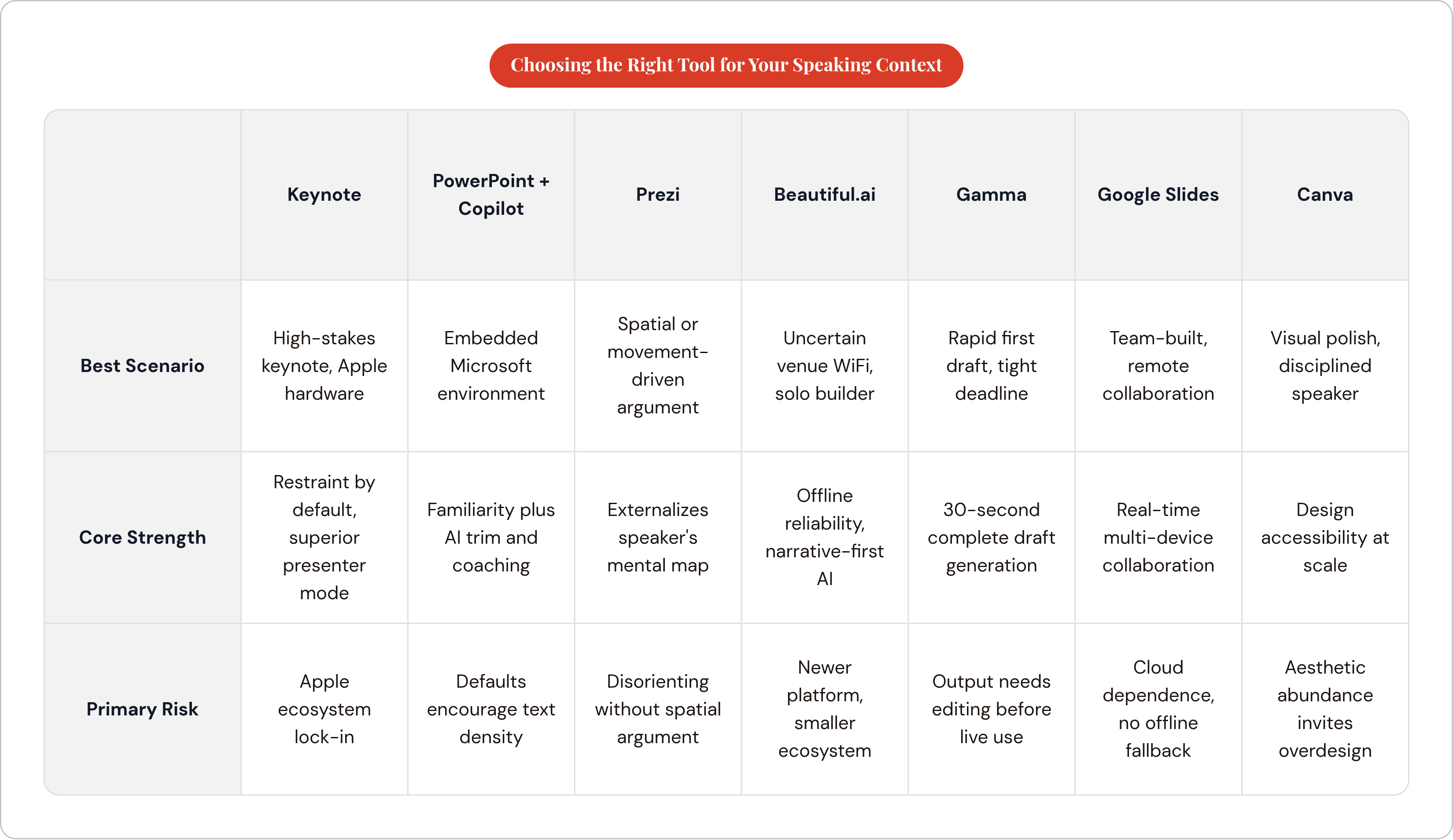
The single most decisive variable is not visual style, AI capability, or template library. It is the venue's technical environment combined with the speaker's relationship to their own preparation process. Everything else is secondary.
The routing is relatively straightforward once those two variables are honest:
Large conference stage, speaker's own laptop, uncertain WiFi: Beautiful.ai. The desktop app and offline reliability are not conveniences here; they are preconditions for the talk happening at all.
TED-style or keynote address where the room experience is the entire product: Keynote, if the speaker is on Apple hardware. Beautiful.ai if the environment is cross-platform.
Live pitch, sales presentation, or teaching session where spatial narrative matters: Prezi, for speakers whose argument has actual structural movement that benefits from visualization.
Already inside Microsoft 365, want AI assistance without migrating: PowerPoint with Copilot. The familiarity advantage is real, and the Copilot integration is now capable enough to justify staying.
Need a first draft fast to begin rehearsing from: Gamma, with the understanding that the output requires an editing pass before it serves a live audience.
Team-built deck, remote collaboration is the binding constraint: Google Slides.
Visual impact is the priority and the speaker trusts their own discipline: Canva.
One principle cuts across all of these: the deck is the speaker's supporting document, not their script. Any tool that tempts a speaker to read from the screen is working against the speaker, regardless of how sophisticated or beautiful the slides are. The tool that wins is the one that keeps the speaker's voice at the center of the room.
The part no software can do: the delivery that makes slides irrelevant
A significant share of people worldwide report meaningful fear of public speaking, and survey data consistently shows that younger speakers, including Gen Z cohorts, report higher anxiety levels than older generations. No slide tool resolves that gap. No template eliminates nerves. No AI feature generates confidence.
What does build confidence is repetition with feedback, the same mechanism that develops any athletic or technical skill. Eloquence and composure are accumulated through reps, not through finding the correct platform. Every speaker I've watched improve did it the same way: they rehearsed until the words flowed freely, then performed well even with an imperfect deck. Every speaker I've watched struggle on stage hadn't rehearsed enough, and even the most restrained, carefully designed presentation couldn't save them.
This is where the software conversation ends and the practice conversation begins. Some tools score verbal delivery on a daily basis and create a structured, measurable feedback loop, addressing the dimension of public speaking performance that no slide platform touches: what actually comes out of the speaker's mouth, how it sounds, and whether it is improving over time.
The competitive advantage isn't the deck. It is the speaker who has put in enough reps to make the deck beside the point.